HOW CAN GROHE PRODUCTS INTEGRATE INTO A COMPLETE DESIGN-LED LIFESTYLE?
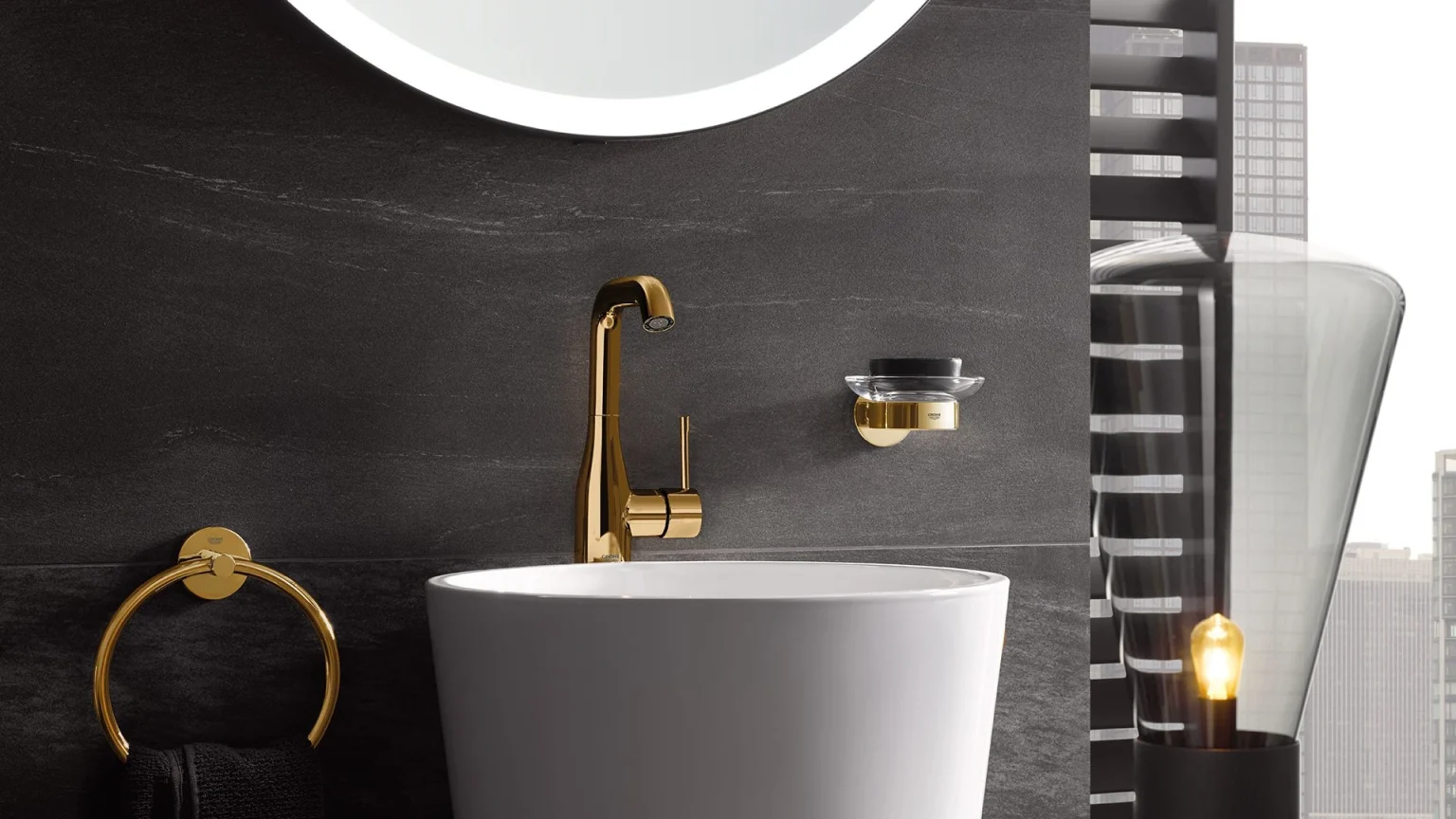
GROHE launched SPA Colours – a new range of colors and finishes for its Essence range of faucets. Conceived with the design community in mind, the extensive product line serves as a toolbox for architects and interior designers with a precise look and feel for each individual space. Michael Seum, Vice President of Design at GROHE, has been closely involved with the project from the beginning.
When he discovered exactly how enthusiastically SPA Colours were received by professionals working with bathrooms, he decided to go one step further to assist their design process. He enlisted the Barcelona-based trend consultant Gudy Herder to develop trend panels for four of the line’s most successful finishes.
Their goal: to highlight the connection between SPA Colours and the underlying consumer trends that informed their design. The four panels are highly visual reference boards that embed each finish in distinct lifestyles via the interior choices that reflect them. GROHE Magazine met Michael Seum and Gudy Herder at her studio in Barcelona’s Gràcia neighborhood to discuss the importance of understanding consumer trends, what it takes to inspire the design community, and the continuing appeal of GROHE’s SPA Colours range.
WHAT DROVE GROHE TO WORK WITH A TREND EXPERT?
Michael Seum (MS): Trends are an important aspect of our process at GROHE. So we need to reach out and make sure we’re working with the experts in the field. It’s about creating a consistent dialogue in the world of trends and to really connect back to some of our current activities in the market. In the end we want to inspire the architects and designers who use our products and to offer them beautiful pieces that work within the spaces they design.
Gudy Herder (GH): Lifestyle trends are so much more than just colors, shapes, and materials. Those are just the signifiers of deeper consumer cravings. Trends reflect what we need, what we’re looking for in our lives, and how this influences our purchasing decisions. For a company like GROHE it’s therefore absolutely necessary to research trends in order to understand customers.
THE FOUR TREND PANELS YOU CREATED – CELESTIAL AWAKENING, FINE RAW, GREEN BOND, SANCTUM SANTORUM – INCLUDE COLOR SAMPLES, SWATCHES OF FABRIC, AND MOOD IMAGES. HOW DOES THIS WORK?
GH: After some research, I get a few key words together that really describe the trend and then I try to translate these key words into materials, colors, and finishes. In the end the whole idea is to get people inspired by thinking about some of these possibilities on the board, how they can translate what they have in their mind into a physical space. You don’t want to be too prescriptive but you want it to be defined enough to at least allow them to start thinking about it in that sense.
MS: With our products we usually deliver an object to an environment that has been carefully conceived by other creatives according to their customers’ needs. So what we’re doing here is highlighting how some our new colors and finishes are connected to relevant lifestyle trends. I think the stories that Gudy created are very useful in inspiring architects to see our products in a whole new light. Ultimately, no one is looking only for product experiences anymore. They want a room and they want that room to tell a story.

WHAT DO YOU ULTIMATELY WANT TO GET OUT OF THE COLLABORATION?
MS: The most important objective for me is to strike a dialogue and a constant interaction with the design community through these boards. I see them as an inspirational tool and as a gateway to make sure that our audience understands us as being responsive. But having these boards is also extremely useful in helping our GROHE team to tell the story – and that’s really critical for us too.
GH: What I really liked about Michael’s approach was the idea of not only inspiring the end consumer – which of course should always be a consideration – but also creating something for architects and interior designers or decorators. To show them how to integrate SPA Colours into the environments they create.
LOOKING AT THE COLLECTION – WHAT MAKES ESSENCE SPA COLOURS SO APPEALING TO ARCHITECTS AND DESIGNERS?
MS: Our SPA Colours collection is really about taking a line of products into new territories for interior design. I think they are beautiful objects, but in the end we want professionals and consumers alike to see how these objects work within the spaces they envision.
GH: The four colors that were selected for this project are very much on trend. It’s a good moment for SPA Colours because each one responds to a different set of consumer desires. I was really inspired by the collection – it’s perfect because they each fit to a certain trend we are seeing right now.
WHAT CAN WE EXPECT FROM THIS COLLABORATION IN THE FUTURE?
MS: For me it’s all about a more long-term vision for how we work within the space. I want our audience to see how GROHE is really investing in the future. So our next collaboration will probably see a reversal of this process, where we’ll map the trends and then the project which surfaces will follow those lifestyle trends.
GH: Once you start working with trends I think it’s really important that you don’t think in terms of only a single project. A company that dives deep into trends has to stay on track, and I believe that GROHE has a lot of potential because they are really forward-thinking with their designs. So what we’re trying to do is create future customer stories. Where is the journey going and how can we translate that into a beautiful product?
MS: As designers, going into the future is our role. It’s really about shaping the future of how we will live, and I think within GROHE we have a tremendous connection to the architectural community, which also thinks along the same lines. I regularly meet architects and designers, and what I crave to understand is how GROHE can support their vision for the projects they are currently conceiving. So rather than just creating objects and things in space, design for me is thinking about how we will live in future.