Design is the key pillar to the GROHE brand.

Michael Seum
Vice President of Design, Grohe
Q: HOW DOES ATRIO FIT IN THE LATEST AND FUTURE DESIGN STYLES?
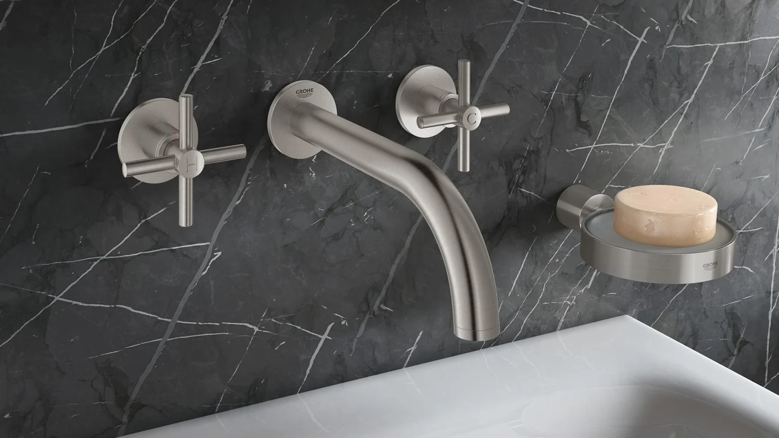
MS: In the past, Atrio was a mixture of style segmentations – contemporary and cosmopolitan. In this relaunched Atrio series, we have firmly rooted the new collection in our contemporary design segmentation which is one of the most timeless of styles within the GROHE SPA portfolio. I think as you look at the design elements, it is purely constructed from a single geometry, a circle yet with subtle classical design details. The details within the collection are composed of pure symmetrical intersections and a precise attention to proportion and scale. The result is an icon of pure elegance and precision. The elegance of the Atrio collection gives interior designers, architects, and consumers more flexibility in terms of what type of bath environments they can do.
Q: WHAT WAS THE OVERARCHING IDEA BEHIND THE REDESIGN OF ATRIO? WHICH DETAILS ARE YOU MOST PROUD OF?
MS: The idea behind new Atrio is design permanence – the design is going to last a long time, it’s iconic. This is not about risk-taking design, but more about really paying attention to details and being obsessive about proportions. When we started the design process, we tried to set out to do an iconic style. For me, the definition of iconic is when it can be drawn by memory. In ten years, it will be as iconic as when we designed it from day one. It also pays homage to the previous generation of Atrio but it is clearly a new direction. Atrio has a contemporary feel, but I think with the right color and finish, this collection can totally transform itself into a cosmopolitan or classic environment. That gives consumers, architects, and interior designers freedom to use this in any way possible.
Q: WHAT ARE THE CHALLENGES IN DESIGNING A NEW FAUCET IN HETEROGENIC STYLE SEGMENTS?
MS: The challenge was to find the balance between paying respect to the previous line of Atrio and creating something unique, new and while achieving design permanence. And then, of course, our challenge is to stand out in a highly competitive environment as well. The styling cues that we have been able to achieve are uniquely GROHE and express our design DNA (signature elements) perfectly. We explored so many different design possibilities and in the end, came down to design reduction. Atrio is an obsessive simplification of the previous line. Finding out the right proportion and attention to detail is what makes this line so iconic and permanent. I think we crafted a true icon of elegance and precision and I am proud of the team’s design work on this line.


